Evaluating Classification Models: Confusion Matrices and ROC Curves
Confusion Matrix
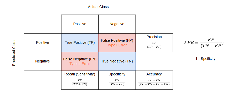
Structure and Components
A confusion matrix is typically presented as a table with four key components:
- True Positives (TP): Cases where the model correctly predicts the positive class.
- True Negatives (TN): Cases where the model correctly predicts the negative class.
- False Positives (FP): Cases where the model incorrectly predicts the positive class (Type I error).
- False Negatives (FN): Cases where the model incorrectly predicts the negative class (Type II error).
For binary classification problems, the matrix is typically a 2x2 grid. However, it can be expanded for multi-class classification problems, where each row represents the actual class and each column represents the predicted class.
Type I Error Examples
A Type I error occurs when we reject a true null hypothesis, resulting in a false positive.
-
Medical Diagnosis: A doctor diagnoses a patient with cancer based on test results, but the patient actually doesn't have cancer. This false positive diagnosis may lead to unnecessary treatments, anxiety, and financial burden.
-
Quality Control: A manufacturing plant rejects a batch of products believing they are defective when they actually meet quality standards. This could result in wasted resources and unnecessary production costs.
-
Criminal Justice: An innocent person is convicted of a crime they didn't commit based on circumstantial evidence. This false conviction can lead to wrongful imprisonment and severe personal consequences.
-
Drug Testing: An athlete tests positive for a performance-enhancing drug due to a false positive result, leading to disqualification or suspension when they haven't actually used any banned substances.
Type II Error Examples
A Type II error occurs when we fail to reject a false null hypothesis, resulting in a false negative.
-
Medical Screening: A cancer screening test fails to detect cancer in a patient who actually has the disease. This false negative could delay crucial treatment and worsen the patient's prognosis.
-
Product Safety: A company's quality control process fails to detect a defect in a product, allowing unsafe items to reach consumers. This could lead to injuries, product recalls, and damage to the company's reputation.
-
Environmental Protection: A test designed to detect water pollution fails to identify contamination in a water source. This could result in people consuming unsafe water and potential health hazards.
-
Financial Fraud Detection: A bank's fraud detection system fails to flag a series of suspicious transactions that are actually fraudulent. This could lead to significant financial losses for the bank and its customers.
-
Drug Efficacy Studies: A clinical trial concludes that a new drug is not effective in treating a disease when it actually is. This Type II error could prevent a potentially life-saving medication from reaching patients who need it.
Key Metrics Derived from Confusion Matrix
The confusion matrix allows us to calculate several important performance metrics:
Accuracy: The proportion of correct predictions (both true positives and true negatives) among the total number of cases examined.
Precision: The proportion of correct positive predictions out of all positive predictions.
Recall (Sensitivity): The proportion of actual positive cases that were correctly identified.
Specificity: The proportion of actual negative cases that were correctly identified.
F1-Score: The harmonic mean of precision and recall, providing a single score that balances both metrics.
Benefits and Applications
Confusion matrices offer several advantages:
- They provide a detailed breakdown of correct and incorrect classifications for each class.
- They help identify which classes are being confused with each other.
- They are particularly useful for imbalanced datasets where accuracy alone may be misleading.
Interpreting a Confusion Matrix
To interpret a confusion matrix:
- Look at the diagonal elements, which represent correct classifications.
- Examine off-diagonal elements to see where misclassifications occur.
- Calculate performance metrics to get a comprehensive view of model performance.
ROC curve
The ROC (Receiver Operating Characteristic) curve is a powerful tool for evaluating the performance of binary classification models. It complements the confusion matrix by providing a visual representation of the trade-off between true positive rate and false positive rate across various classification thresholds.
Key Components of ROC Curve
-
True Positive Rate (TPR): Also known as sensitivity or recall, TPR is plotted on the y-axis. It's calculated as:
-
False Positive Rate (FPR): Plotted on the x-axis, FPR is calculated as:
Interpreting the ROC Curve
- The curve plots TPR against FPR at various threshold settings.
- A perfect classifier would have a point in the upper left corner (0,1), representing 100% sensitivity and 100% specificity.
- The diagonal line from (0,0) to (1,1) represents the performance of a random classifier.
- Curves closer to the top-left corner indicate better-performing models.
Area Under the Curve (AUC)
The AUC is a single scalar value that quantifies the overall performance of the classifier:
- AUC ranges from 0 to 1, with higher values indicating better performance.
- An AUC of 0.5 suggests no discrimination (equivalent to random guessing).
- AUC values can be interpreted as follows:
- 0.9 - 1.0: Excellent
- 0.8 - 0.9: Good
- 0.7 - 0.8: Fair
- 0.6 - 0.7: Poor
- 0.5 - 0.6: Fail
Advantages of ROC Curves
- They provide a comprehensive view of classifier performance across all possible thresholds.
- ROC curves are insensitive to class imbalance, making them useful for evaluating models on imbalanced datasets.
- They allow for easy comparison between different classification models.
Limitations and Considerations
- ROC curves may not be ideal for highly imbalanced datasets, where precision-recall curves might be more informative.
- They don't provide information about the actual predicted probabilities, only their rank ordering.
.png)
Practical Application
In Python, you can easily plot ROC curves using libraries like scikit-learn and matplotlib. Here's a basic example:
from sklearn.metrics import roc_curve, auc
import matplotlib.pyplot as plt

# Assuming y_true are the true labels and y_scores are the predicted probabilities
fpr, tpr, thresholds = roc_curve(y_true, y_scores)
roc_auc = auc(fpr, tpr)

plt.figure()
plt.plot(fpr, tpr, color='darkorange', lw=2, label='ROC curve (AUC = %0.2f)' % roc_auc)
plt.plot([0, 1], [0, 1], color='navy', lw=2, linestyle='--')
plt.xlim([0.0, 1.0])
plt.ylim([0.0, 1.05])
plt.xlabel('False Positive Rate')
plt.ylabel('True Positive Rate')
plt.title('Receiver Operating Characteristic (ROC) Curve')
plt.legend(loc="lower right")
plt.show()
By using ROC curves in conjunction with confusion matrices, you can gain a comprehensive understanding of your classification model's performance and make informed decisions about threshold selection and model comparison.